Before
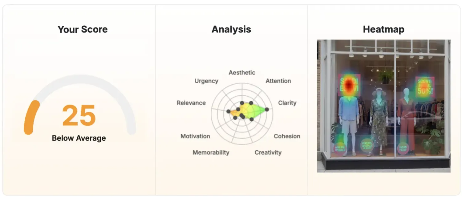
25/100
Baseline window


In physical retail, your window is your fastest “ad unit”: it has a few seconds to stop someone, explain the offer, and trigger the next action. In this project, a clothing shop used the NLP service from Hoken Tech to diagnose why a summer-sale window wasn’t converting attention into foot traffic — and implemented a targeted set of improvements to move the overall score from 25/100 to 39/100.
What made the difference wasn’t “more posters” or “louder colors”, but clearer messaging, reduced cognitive load, stronger visual hierarchy, and more actionable persuasion cues — the exact levers highlighted in the Hoken Tech report (sign placement, consolidation of discounts, CTA, multilingual clarity, and behavioral principles like anchoring, scarcity, bandwagon, and authority).
The window already had strong raw ingredients:
High-contrast red sale signs with large white text (“SALDI ESTIVI”, “SCONTI FINO AL 50%!”) that are visible from a distance.
Mannequins styled in complete summer outfits, making the offer tangible (you can immediately imagine wearing the items).
Urgency cues (“OFFERTA SPECIALE!”, “ULTIMI PEZZI!”) that can trigger faster decisions.
But the report also flags conversion blockers that typically reduce “stop power”:
Too many messages at once (“SALDI ESTIVI”, “SCONTI FINO AL 50%”, “OFFERTA SPECIALE”, “ULTIMI PEZZI”), which increases cognitive load and dilutes the main takeaway.
Poor sign positioning: rectangular signs partially obscured mannequin heads/clothing; circular signs were too low and easy to miss.
No explicit call to action (nothing that tells people what to do next).
Language barrier: all key promotional messaging was in Italian only, reducing comprehension for non-Italian speakers (tourists and some locals).
Generic offers not visually connected to specific products, forcing people to enter the store just to understand what’s included.
These issues typically don’t “feel” dramatic — but in walk-by contexts, small frictions are enough to lose the customer.
This clothing store window display improved its clarity and conversion triggers by simplifying the message, strengthening visual hierarchy, repositioning signage to avoid covering outfits, and adding a clear call-to-action. The result was a measurable uplift in the Hoken Tech General Score.
Below is a structured summary of the improvements from the report, rewritten as an implementation plan.
A) Add multilingual messaging (or clear translations)
Problem: Promotional signs are exclusively in Italian → language barrier.
Fix: Make key sales messages bilingual (at least the headline + primary offer).
Practical window solution
Keep Italian as the “main” language, but add a short English line underneath in a smaller font.
Example headline block:
SALDI ESTIVI
SUMMER SALE
SCONTI FINO AL 50%
UP TO 50% OFF (selected items)
This preserves local relevance while expanding reach.
B) Consolidate the offer into one primary message (clear hierarchy)
Problem: Too many discount messages compete at a glance.
Fix: Choose one dominant promise and make everything else supporting detail.
Recommended hierarchy
Main headline: “Summer Sale / Saldi Estivi”
Main offer: “Up to 50% off / Sconti fino al 50%”
One supporting hook (only one): “Last pieces” or “Special offer”
CTA: “Come in today” / “Entra ora”
This reduces cognitive demand and increases instant comprehension.
C) Add a clear call-to-action (CTA)
Problem (report): No direct invitation to enter.
Fix: Add one short, inviting CTA that tells the next step.
CTA examples (bilingual, window-friendly)
Enter now — find your summer look
Entra ora — trova il tuo look estivo
Try it on in-store today
Provalo in negozio oggi
Limited pieces — don’t miss out
Pochi pezzi — non perderteli
The report explicitly lists multiple principles and how to strengthen them. Here’s a clean “marketing translation” of those points:
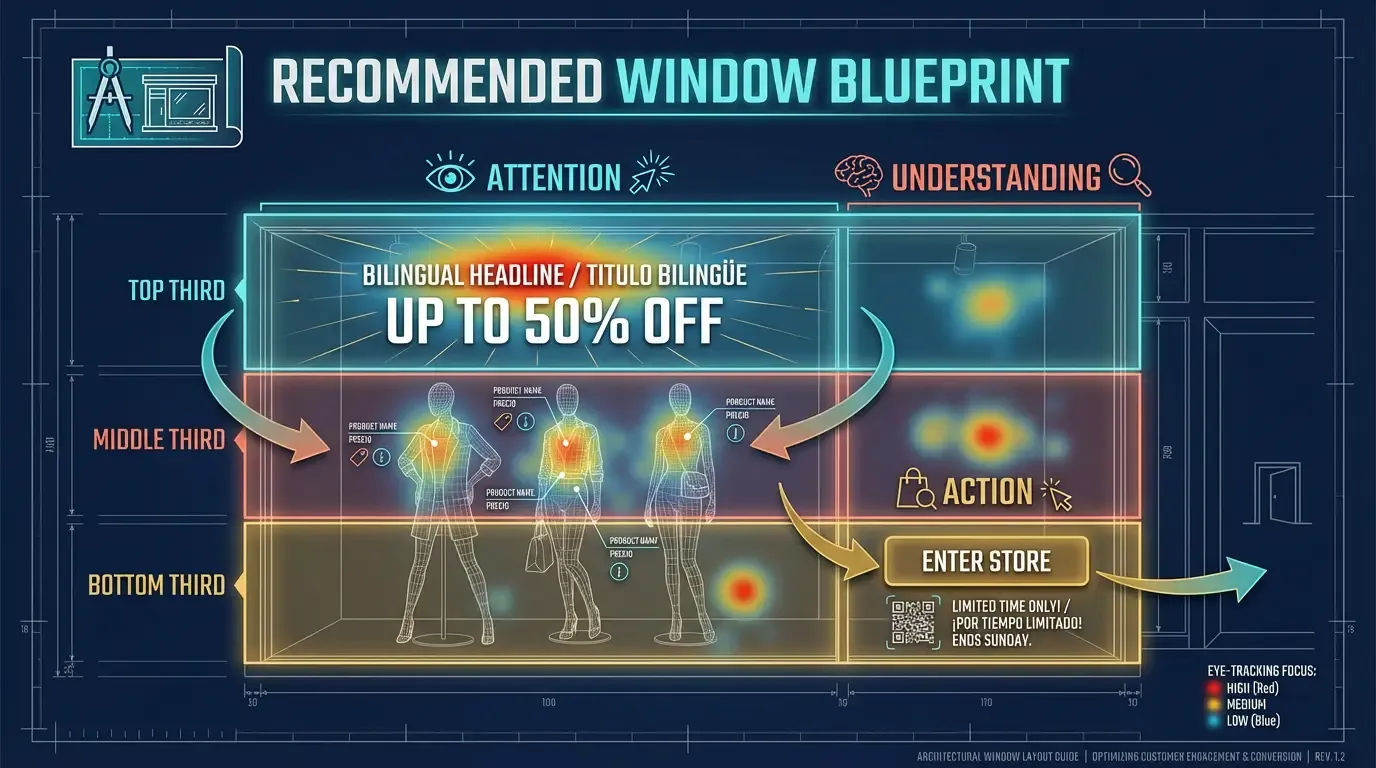
Recommended window blueprint (simple layout you can describe)
Top third (Attention):
One headline block (bilingual): “SALDI ESTIVI / SUMMER SALE”
One main offer: “Up to 50% off (selected items)”
Middle (Understanding):
Mannequins fully visible (no signs over faces/clothes)
1–3 product-linked tags (e.g., “Linen sets”, “Dresses”, “Sandals”)
Bottom third (Action):
One CTA + optional QR: “Enter now” / “Scan for extra 10% today”
If you use scarcity, make it specific: “Only 7 items left in this look”
This structure directly reflects the report’s focus on visibility, hierarchy, reduced cognitive load, and action prompting.
Users typically scan web pages rather than reading fully, absorbing just 20–28% of text — a pattern that applies to quick-glance scenarios like shop windows (How Users Read on the Web). Eye-tracking confirms an F-shaped reading path, underscoring why key details must align with natural eye flow (F-Shaped Pattern for Reading Web Content).
Cognitive Load Theory shows that overwhelming users with competing messages spikes mental effort and impairs decisions (Cognitive Load Theory Overview; original: Sweller, J. (1988). Cognitive load during problem solving: Effects on learning. Cognitive Science, DOI link).
Scarcity boosts perceived value, as proven in experiments where limited supply inflated ratings (Scarcity Principle in Psychology; classic study: Worchel, S., et al. (1975). Effects of supply and demand on ratings of object value. Journal of Personality and Social Psychology, DOI link).
By combining NLP techniques with the capabilities of eye tracking, you can speak to both the heart and the eyes of your audience — ensuring creativity, precision, and measurable results. Hoken Tech offers you this comprehensive service to center your users’ sensory and visual experience, turning every message into an engagement opportunity.
Ready to take your campaigns to the next level? Book a free demo now and discover how to revolutionize your marketing with a data-driven, psychologically advanced approach.
Use Hoken Tech to identify quick visual and messaging wins, then iterate with measurable tests to increase foot traffic.
Is a marketing and visual-impact analysis service that reviews a creative asset (like a storefront window, poster, or promotional layout) and produces a report with prioritized improvements to increase clarity, attention capture, and conversion triggers.
In retail windows, this typically includes message hierarchy, sign placement, readability, cognitive load, calls-to-action, language clarity (including multilingual needs), and behavioral principles (e.g., anchoring, scarcity, social proof).
The General Score is a summarized indicator of how effective the window is likely to be at communicating the offer quickly, directing attention to the right elements, and prompting action. A higher score generally signals stronger clarity, better hierarchy, and fewer friction points for passersby.
The score increased after implementing targeted recommendations such as consolidating multiple competing discount messages into one primary offer, repositioning signs so they are visible at eye level without covering the outfits, and adding a clear call-to-action to encourage entry.
Additional improvements included clearer visual hierarchy, better legibility for secondary offers, and optional multilingual lines for key promotional messages where audience mix makes that beneficial.
Storefront windows are “glance environments”: people decide in seconds whether to stop or keep walking. If the main offer is too low, too cluttered, or blocked by other elements, it can be missed entirely.
Eye-level placement helps ensure the headline and primary discount are seen quickly, while keeping merchandise visible preserves the “product desire” component.
Cognitive load is the amount of mental effort required to understand what you’re seeing. When a window contains too many headlines, discounts, and competing badges, the viewer may not know what matters most — so they move on.
Reducing cognitive load usually means: one dominant message, short supporting details, consistent typography, and a single, clear next step (CTA).
NLP-inspired messaging focuses on how language influences attention, emotion, and decision-making. In practice, this can mean using clearer sensory language, more directive calls-to-action, and benefit-led framing that makes the offer feel tangible.
For storefronts, the most effective approach is typically short and concrete: one benefit, one offer, one action.
If your location attracts tourists or non-native speakers, bilingual key lines can increase comprehension and engagement without replacing the local language. The best practice is to keep the primary headline in the local language and add a shorter translation line beneath it, so the design remains clean and readable.
The best CTA is short, specific, and aligned with your goal. If you want foot traffic, use action verbs like “Come in,” “Try it on today,” or “Discover the collection inside.” If you want measurable engagement, consider adding a QR code tied to a simple incentive or landing page.
Track changes in foot traffic and conversion signals before and after updates. Typical metrics include: passersby-to-entry rate, in-store inquiries about the featured looks, and sales of items displayed in the window.
For ongoing improvement, run simple A/B tests (e.g., CTA wording, headline layout, or scarcity phrasing) and compare results over consistent time windows.
Many of the highest-impact changes — like simplifying the headline, repositioning signage, and adding a CTA — can be implemented quickly. More advanced iterations (social proof elements, authority badges, repeated testing cycles) are best rolled out in phases to keep the window clean and measurable.
nft, hoken tech, blockchain, cryptoart, eos, nft art, artificial intelligence, ai, watch authentication, crypto artist, nfts, web3, nft game, web3 game, videogame, nft distributor, videogame blockchain


